
5 things to check when looking for office space

#1
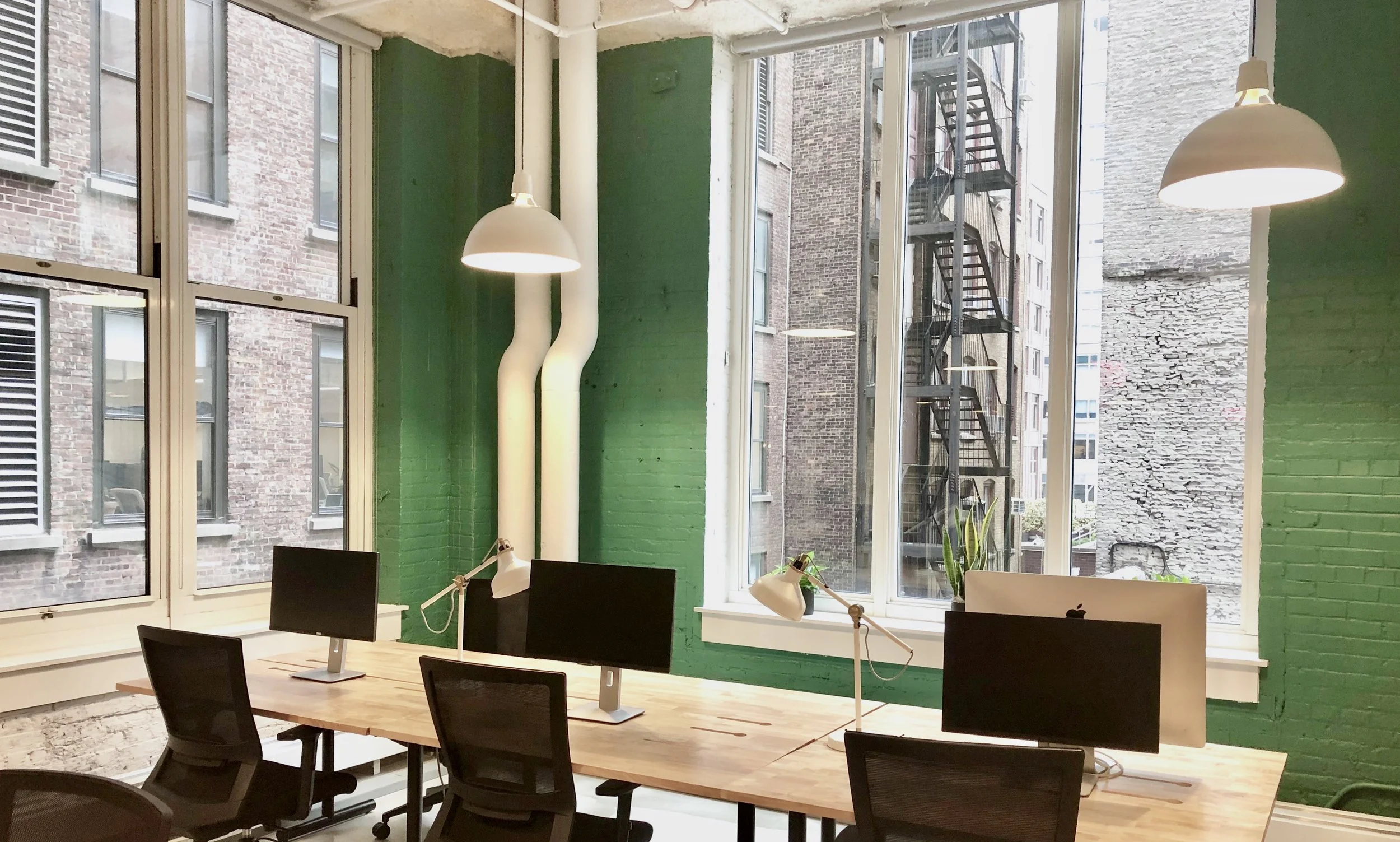
The distance from the center of the space to the windows should be 10–14m. More than 18m and much of your team sits in darkness.
#2
Columns should be spaced at least 8–9m apart. Irregular or narrow spacing kills layout flexibility.
#3
Ceilings need to be tall enough to accommodate ductwork, lighting, and electrical without feeling cramped. Aim for 3.6m if unfinished, 2.7m minimum if already fitted out. (Higher is always better.)
#4
Rectangular spaces are easier to fit out than L-shapes, triangles, or anything irregular. If the space is awkward, do a test fit first. (I can help.)
#5
Can you control temperature by zone? Building-wide HVAC means meeting rooms, server closets, and open floors all run at the same setting (and someone is always freezing or complaining).
Not sure what you're looking at? WhatsApp me and I may be able to orient you. +972 (0) 53-892-6032






3 Office space efficiencies that save time and money
If you're debating office spaces and feeling a bit lost...
Consider the space's bones.
You want your raw office space to be efficient.
An inefficient layout can mean unexpected build-out costs, operational issues, and growth constraints.
Before committing, check these three things to identify potential:
***********
(𝟭) 𝗖𝗼𝗿𝗲-𝘁𝗼-𝗪𝗶𝗻𝗱𝗼𝘄 𝗗𝗲𝗽𝘁𝗵 (The Natural Light Maximizer)
The distance between the building’s central service core (elevators, stairs, restrooms) and the outer windows directly impacts how much of your floor plate receives natural light — a key requirement for employee well-being.
𝗢𝗽𝘁𝗶𝗺𝗮𝗹 𝗱𝗲𝗽𝘁𝗵 𝗺𝗲𝗮𝘀𝘂𝗿𝗲𝗺𝗲𝗻𝘁: 10–14 m
𝗪𝗮𝗿𝗻𝗶𝗻𝗴 𝘀𝗶𝗴𝗻: Over 18 m
(𝟮) 𝗦𝘁𝗿𝘂𝗰𝘁𝘂𝗿𝗮𝗹 𝗖𝗼𝗹𝘂𝗺𝗻 𝗦𝗽𝗮𝗰𝗶𝗻𝗴 (The Layout Flexibility Factor)
The consistency and spacing of internal structural columns dictate how easily you can fit your required number of workstations, meeting rooms, and collaboration zones.
𝗢𝗽𝘁𝗶𝗺𝗮𝗹 𝘀𝗽𝗮𝗰𝗶𝗻𝗴 𝗰𝗼𝗻𝘀𝗶𝘀𝘁𝗲𝗻𝗰𝘆: 8–9 m
𝗪𝗮𝗿𝗻𝗶𝗻𝗴 𝘀𝗶𝗴𝗻: Irregular or very narrow spacing
(𝟯) 𝗙𝗹𝗼𝗼𝗿-𝘁𝗼-𝗖𝗲𝗶𝗹𝗶𝗻𝗴 𝗛𝗲𝗶𝗴𝗵𝘁 (The Employee Experience & Infrastructure Factor)
The finished height between the floor and the dropped ceiling affects both the perceived quality of the space and the potential for housing modern infrastructure.
𝗢𝗽𝘁𝗶𝗺𝗮𝗹 𝗳𝗶𝗻𝗶𝘀𝗵𝗲𝗱 𝗵𝗲𝗶𝗴𝗵𝘁: 3+ m
𝗪𝗮𝗿𝗻𝗶𝗻𝗴 𝘀𝗶𝗴𝗻: Low ceilings (<2.7 m)
***********
There are many other elements to consider, and we use the 𝗧𝗲𝘀𝘁 𝗙𝗶𝘁 𝗽𝗿𝗼𝗰𝗲𝘀𝘀 to formally analyze your shortlisted spaces against your specific headcount and budget goals.
Need help comparing office spaces? Book a call to see how we can assist.
Test fit your office BEFORE you lease
How to feel confident an office space works for your team — before you lease:
איך לוודא שהמשרד יעבוד לצוות שלכם — לפני שמחתימים על השכירות:
Do a test fit. 👇 עברית למטה
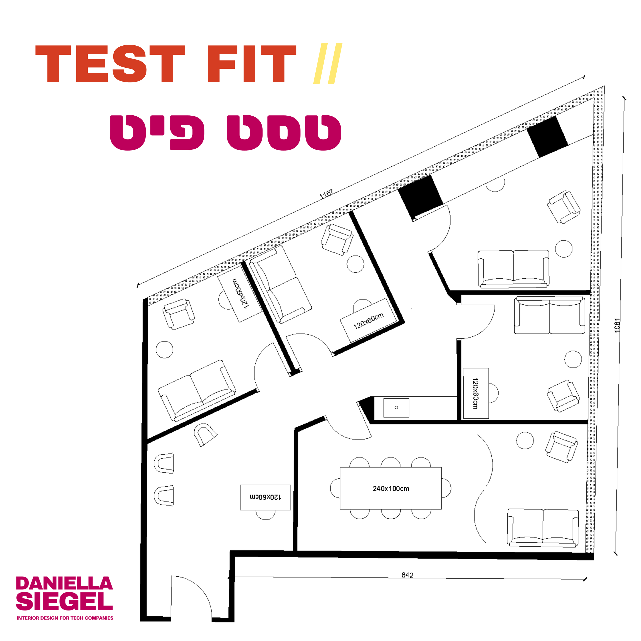
A client came to me to see if this angular corner office space could work for his therapy practice.
It’s tight.
He wants four private rooms — one more spacious than the others — plus a conference room with a therapy space and a receptionist desk, waiting area, and kitchenette.
I managed to give every office a window view, but many areas are a squeeze.
Will it work?
Jury’s out on what he decides.
Every client has their own priorities.
When you do a test fit before making a final decision on a space, your final decision is made with confidence that you’re meeting your key needs.
Want to test fit an office you’re considering? Email me at dsiegelstudio@gmail.com with TEST FIT in the subject line.
---
תעשו טסט פיט.
לקוח פנה אליי לבדוק אם משרד פינתי עם קירות בזווית יכול להתאים לקליניקה שלו.
צפוף.
הוא רוצה ארבעה חדרים פרטיים — אחד קצת מרווח יותר — בנוסף לחדר ישיבות שמשמש גם לטיפולים, עמדת קבלה, אזור המתנה ומטבחון.
הצלחתי לתת לכל משרד נוף מהחלון, אבל כל אזור קצת צפוף.
זה יעבוד?
עוד לא ברור מה הוא יחליט.
כל לקוח והעדיפויות שלו.
כשעושים טסט פיט לפני שמקבלים החלטה על משרד, אפשר לבחור בביטחון — ולדעת שהמקום באמת מתאים לצרכים שלכם.
dsiegelstudio@gmail.com :"רוצים לבדוק משרד שאתם שוקלים? תכתבו לי "טסט פיט.
Avoid facing a wall


I recently did a consultation at a small office. This is the most important layout suggestion I made:
Try not to face a wall.
The space was arranged with three desks, all facing a wall (pic 1 ❌).
If I was that person at the bottom right, I would not be happy about being stuck near the bathroom and staring at a wall in a dark corner.
The CEO had the largest desk, already firmly planted near the window with five monitors on it. Let’s say we leave that as is.
I gave them a few alternatives for the other two employees, including pics 2 ✅ and 3 ✅.
In pic 2, the team is more united and the two assistants get to face the window instead of the wall. They have a solid support behind them (the closet), which gives a feeling of stability.
There’s room for plants, plus a bookshelf by the bathroom.
In pic 3, the team sits together for easy communication. I would give the assistants high-backed chairs, again for stability and comfort.
Here too there's room for plants and storage.
Which would be your preference?
Ingenious innovation in indoor plants
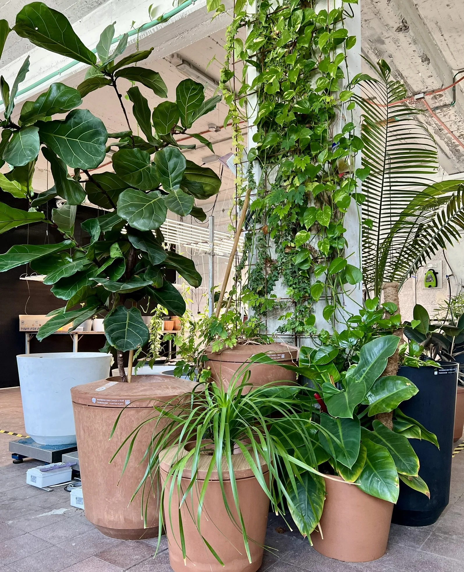
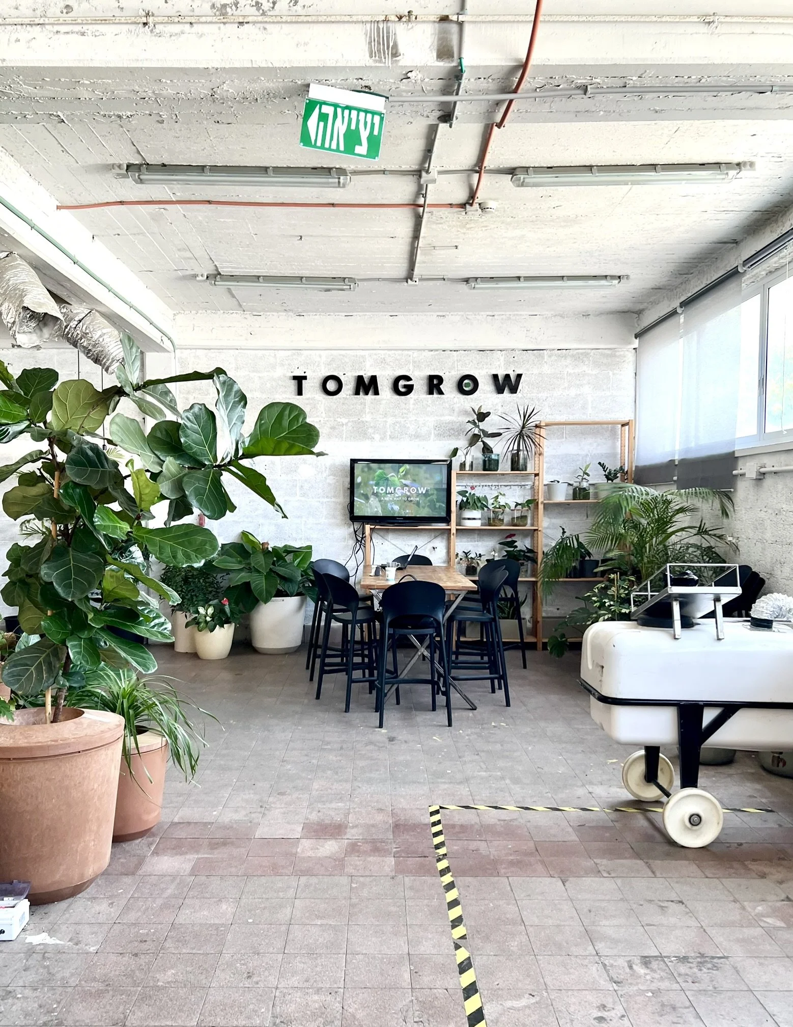
Last month I had a fascinating visit and lab tour of Tomgrow. They’re an Israeli agri-tech company with a patented dirt-free, low-water solution for indoor plants: a nutrient-rich gel that keeps the plants hydrated and thriving (even in artificial light).
Growing plants in Tomgrow’s gel means you skip the mess and hassle of dirt and water your plants only once or twice a year (!). The easy upkeep makes designing greenery into the office a breeze, and it also means plants can be near computers and tech without risk, making for endless design options.
Bringing plant life and natural elements into the office improves employee well-being and makes the office a place people enjoy spending time in.
A big thank you to Tali Osadon, who showed me how Tomgrow’s gel is made and the experiments they’re doing to continuously optimize its performance and expand the line of plants they can grow, from flowers to produce.
Love seeing Israel take the lead in green and efficient solutions in biophilic design!


Anatomy of a Kitchen 101
(Because Python won’t program your mug storage for you)

𝗣𝗿𝗼𝗯𝗹𝗲𝗺: Pillars in the middle of the space
𝗦𝗼𝗹𝘂𝘁𝗶𝗼𝗻: Wrap island around pillar and adjust cabinet depths
𝗣𝗿𝗼𝗯𝗹𝗲𝗺: Beams running through the ceiling
𝗦𝗼𝗹𝘂𝘁𝗶𝗼𝗻: Tuck lighting neatly behind to conceal and wrap carpentry
𝗣𝗿𝗼𝗯𝗹𝗲𝗺: Client wants to store Passover items nearby but there’s no space
𝗦𝗼𝗹𝘂𝘁𝗶𝗼𝗻: Blow out a boydem/attic overhead to create ladder-accessible storage
𝗣𝗿𝗼𝗯𝗹𝗲𝗺: Pillars need to be indestructible
𝗦𝗼𝗹𝘂𝘁𝗶𝗼𝗻: Cover in stain-resistant porcelain tiles that mimic Jerusalem stone
𝗣𝗿𝗼𝗯𝗹𝗲𝗺: Many appliances to store, some that get used often
𝗦𝗼𝗹𝘂𝘁𝗶𝗼𝗻: Appliance garage with built-in outlets
𝗣𝗿𝗼𝗯𝗹𝗲𝗺: Client wants a second fridge, but building a new kitchen around two separate fridges is inelegant
𝗦𝗼𝗹𝘂𝘁𝗶𝗼𝗻: Get one large 120cm double fridge instead
𝗣𝗿𝗼𝗯𝗹𝗲𝗺: Client visits appliance store and thinks the freezer section is too narrow
𝗦𝗼𝗹𝘂𝘁𝗶𝗼𝗻: Rework plans to accommodate a 140cm fridge with a better freezer
𝗣𝗿𝗼𝗯𝗹𝗲𝗺: Client has tons of stuff
𝗦𝗼𝗹𝘂𝘁𝗶𝗼𝗻: Build extra cabinetry under the bar
𝗣𝗿𝗼𝗯𝗹𝗲𝗺: Client also wants vertical pan storage, pull-out garbage, built-in drying racks, towel holders, display shelving, corner storage, a netilat yadayim, cold water, a large island, onion and potato drawers, two ovens, two dishwashers, three separate utensil areas, and custom storage for oversized and unusually shaped items
𝗦𝗼𝗹𝘂𝘁𝗶𝗼𝗻: Plan it baby.


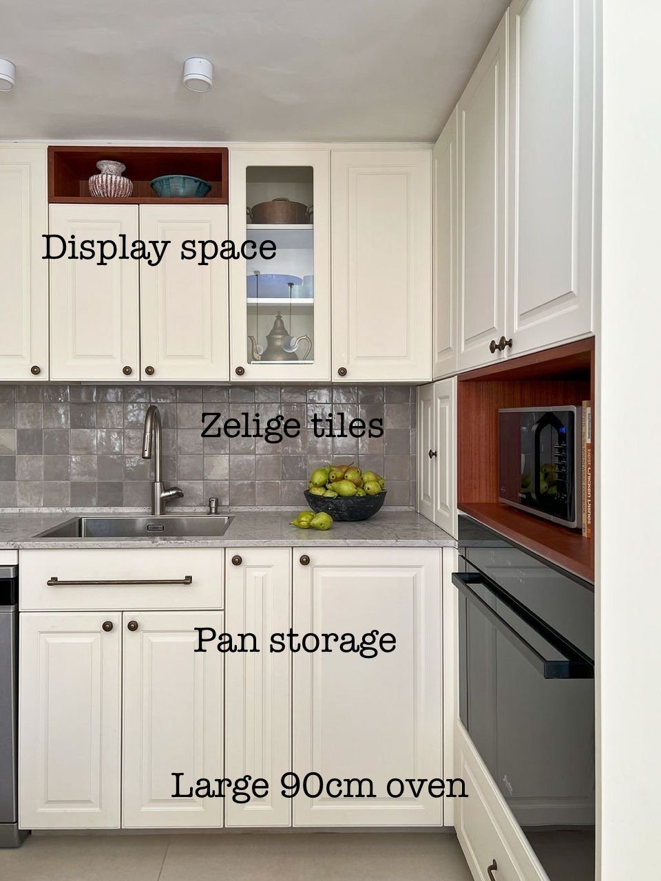


Every client is different. Every space is different. And for every client and space there are unique solutions.

Float your desk


Many people instinctively push their desks against a wall.
Try the Feng Shui 𝗰𝗼𝗺𝗺𝗮𝗻𝗱 𝗽𝗼𝘀𝗶𝘁𝗶𝗼𝗻 instead.
You should face outward with a clear view of the door and your back to a solid wall for a sense of security, control, and leadership (CEO). This setup minimizes distractions and helps you feel more at ease.
Desk tips:
✅ 𝗙𝗮𝗰𝗲 𝘁𝗵𝗲 𝗱𝗼𝗼𝗿, 𝗯𝘂𝘁 𝗻𝗼𝘁 𝗱𝗶𝗿𝗲𝗰𝘁𝗹𝘆 𝗶𝗻 𝗹𝗶𝗻𝗲
Position your desk to see the entrance without sitting directly in front of it, for better awareness and energy flow.
✅ 𝗦𝗼𝗹𝗶𝗱 𝘀𝘂𝗽𝗽𝗼𝗿𝘁 𝗯𝗲𝗵𝗶𝗻𝗱 𝘆𝗼𝘂
Place a solid wall or high-backed chair behind you for stability. Avoid sitting with your back to a window unless covered with curtains (backlighting can turn you into a silhouette on Zoom).
✅ 𝗕𝗮𝗹𝗮𝗻𝗰𝗲𝗱 𝘀𝗽𝗮𝗰𝗲 𝗼𝗻 𝗯𝗼𝘁𝗵 𝘀𝗶𝗱𝗲𝘀
Avoid placing your desk too close to a wall; keep both sides open or supported by furniture for balance.
✅ 𝗗𝗼𝗻'𝘁 𝗳𝗮𝗰𝗲 𝗮 𝘄𝗮𝗹𝗹
If necessary, use mirrors or artwork to create a more open, inspiring space.
✅ 𝗚𝗼𝗼𝗱 𝗻𝗮𝘁𝘂𝗿𝗮𝗹 𝗹𝗶𝗴𝗵𝘁 𝗮𝗻𝗱 𝗮𝗶𝗿 𝗳𝗹𝗼𝘄
Sit near (but not in front of) a window if you can.
Experiment with floating your desk and see how it transforms your workflow and mindset.
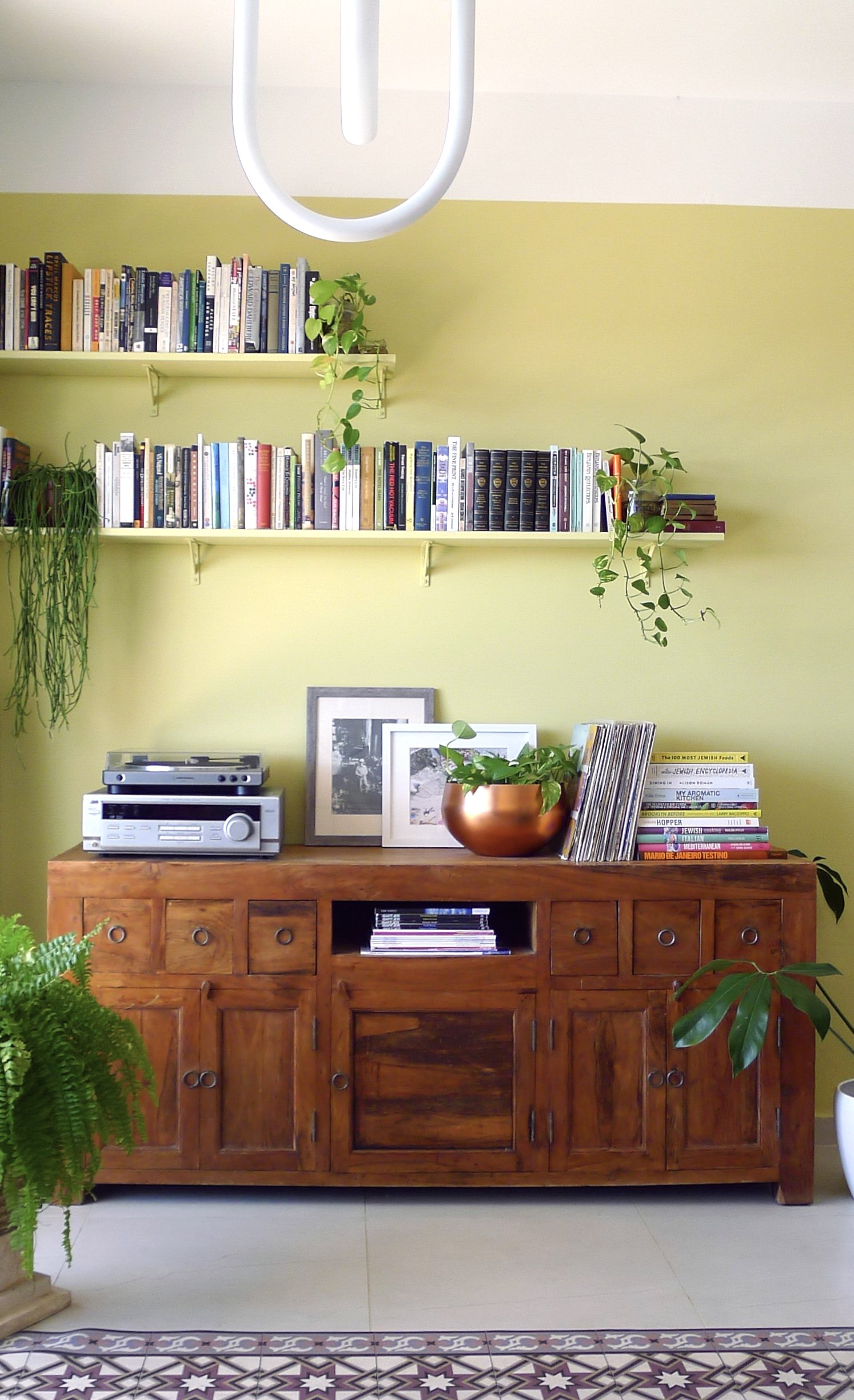

From Spreadsheet to Bookshelf
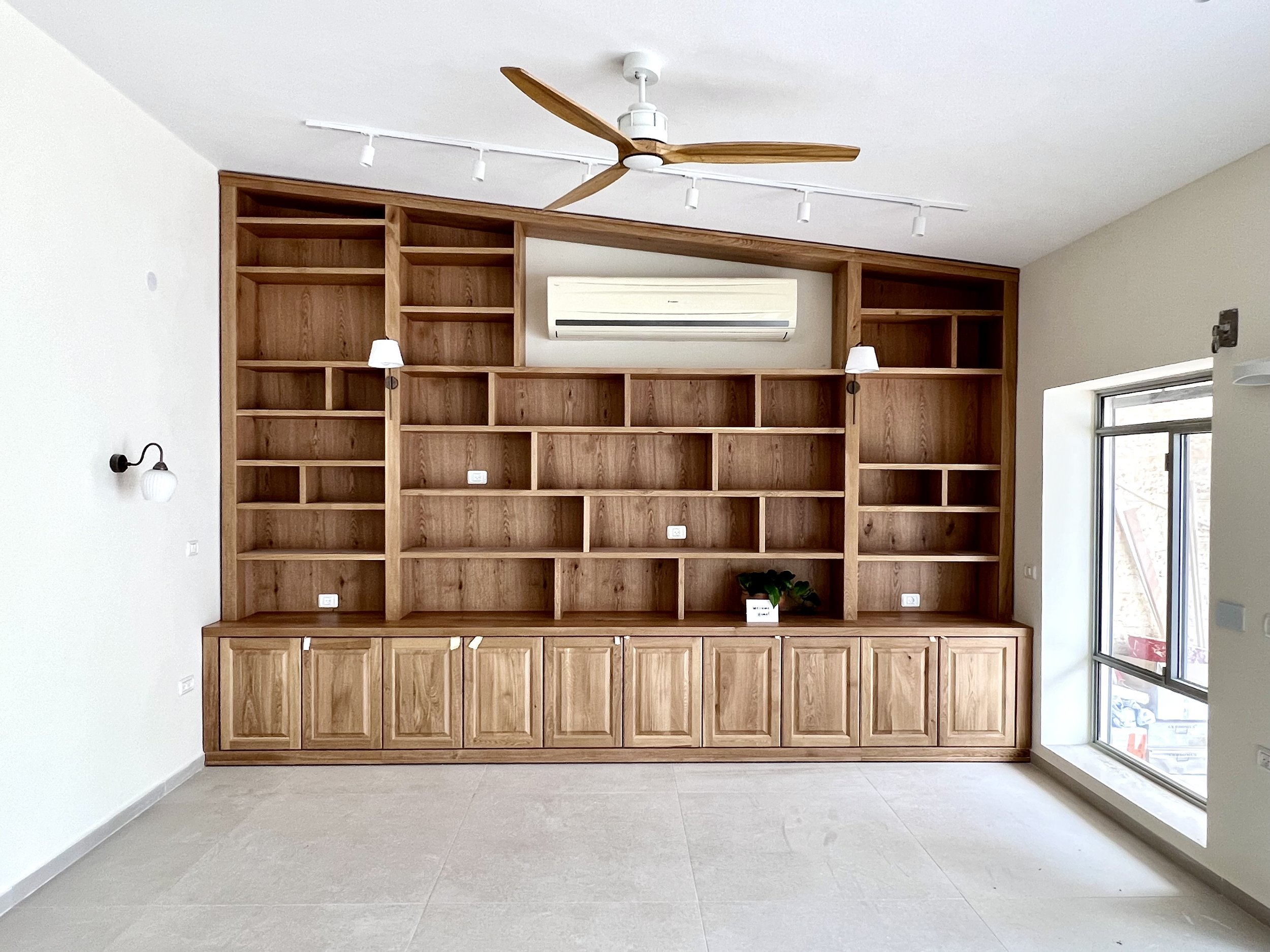
In the #beershevatraditional project, my clients wanted a wall-to-wall, floor-to-ceiling bookshelf to accommodate their library. Their library included books of all shapes and sizes, from kids books accessed daily to various sets of Jewish sefarim to tall megillot used once a year. My clients wanted each type of book to have a clear home, with little space wasted above and around the books. That meant that a set of short 17-cm books needed a different size shelf than a 32-cm-tall set, and a 41-cm-wide set and 90-cm-wide set needed different neighbors. Out the window went the symmetrical bookshelf, in came the spreadsheet:

I ran a few trials to figure out how and where on the bookshelf each type of book could be placed. Once we landed on an arrangement that felt good to them, I tweaked surrounding shelves to make the asymmetry cohesive. Below is where we landed. Since they wanted to keep the existing AC units throughout the home, we worked around the living room AC. And because we needed a tall space high up to accommodate the infrequently used megillot, at left, I balanced this out with a tall space at lower right, in keeping with the overall asymmetry of the piece.

Below you can see the living room when the previous owners still lived there. We removed the old light fixtures as well as the drywall-plus-lighting piece jutting out at top right.
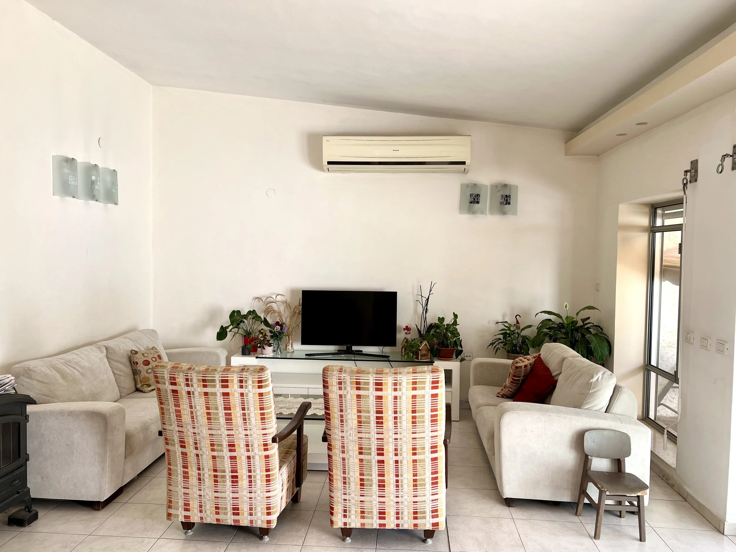
My clients also wanted electrical outlets within the bookshelf, and we included two sconces on the bookshelf for atmospheric lighting. When you want electrical points all over a concrete wall, this is what it looks like to make that happen:

And here’s the bookshelf during installation:

It’s been a while since my clients moved in. I’m looking forward to taking final photos before 2024 wraps.

Distributed Play
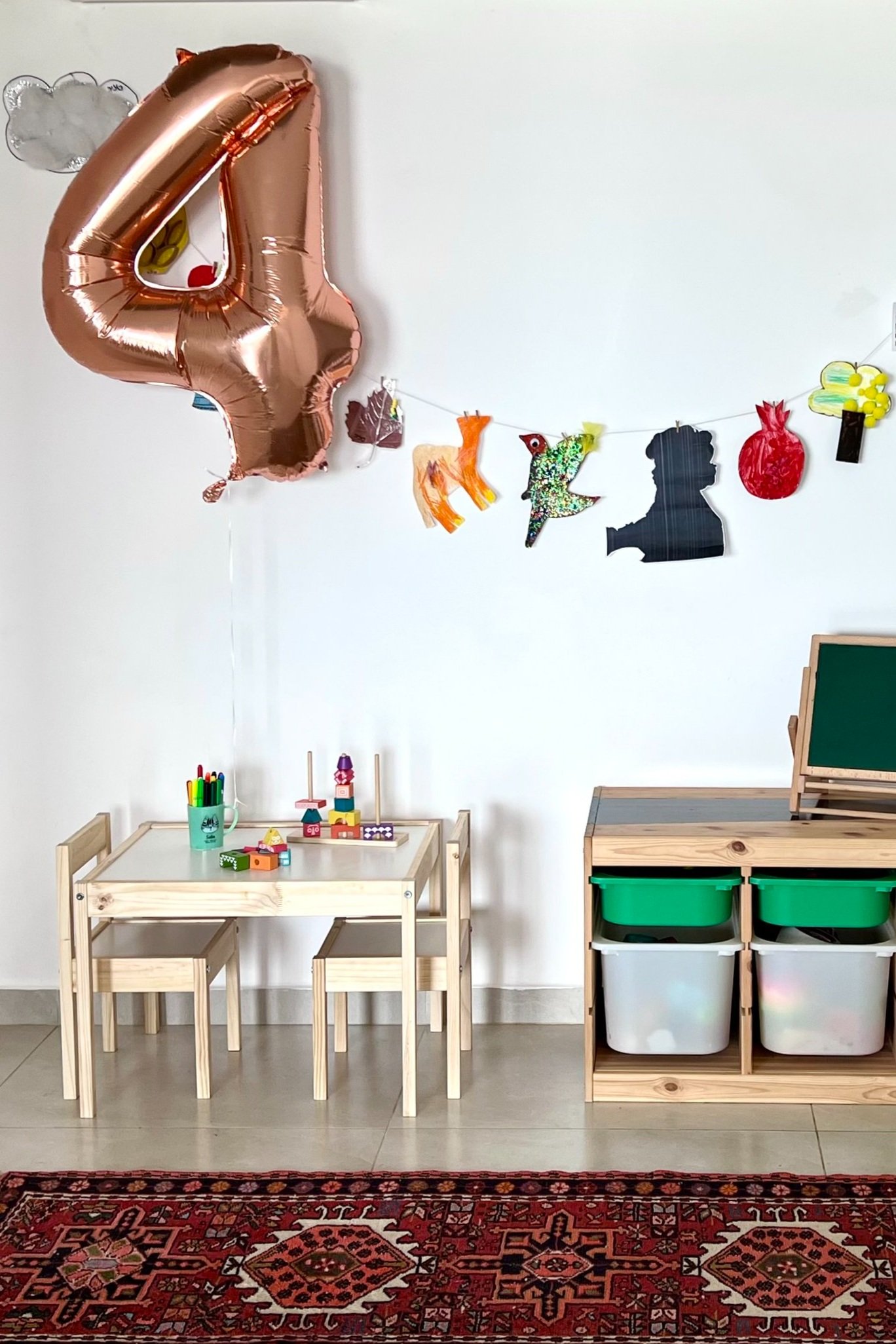
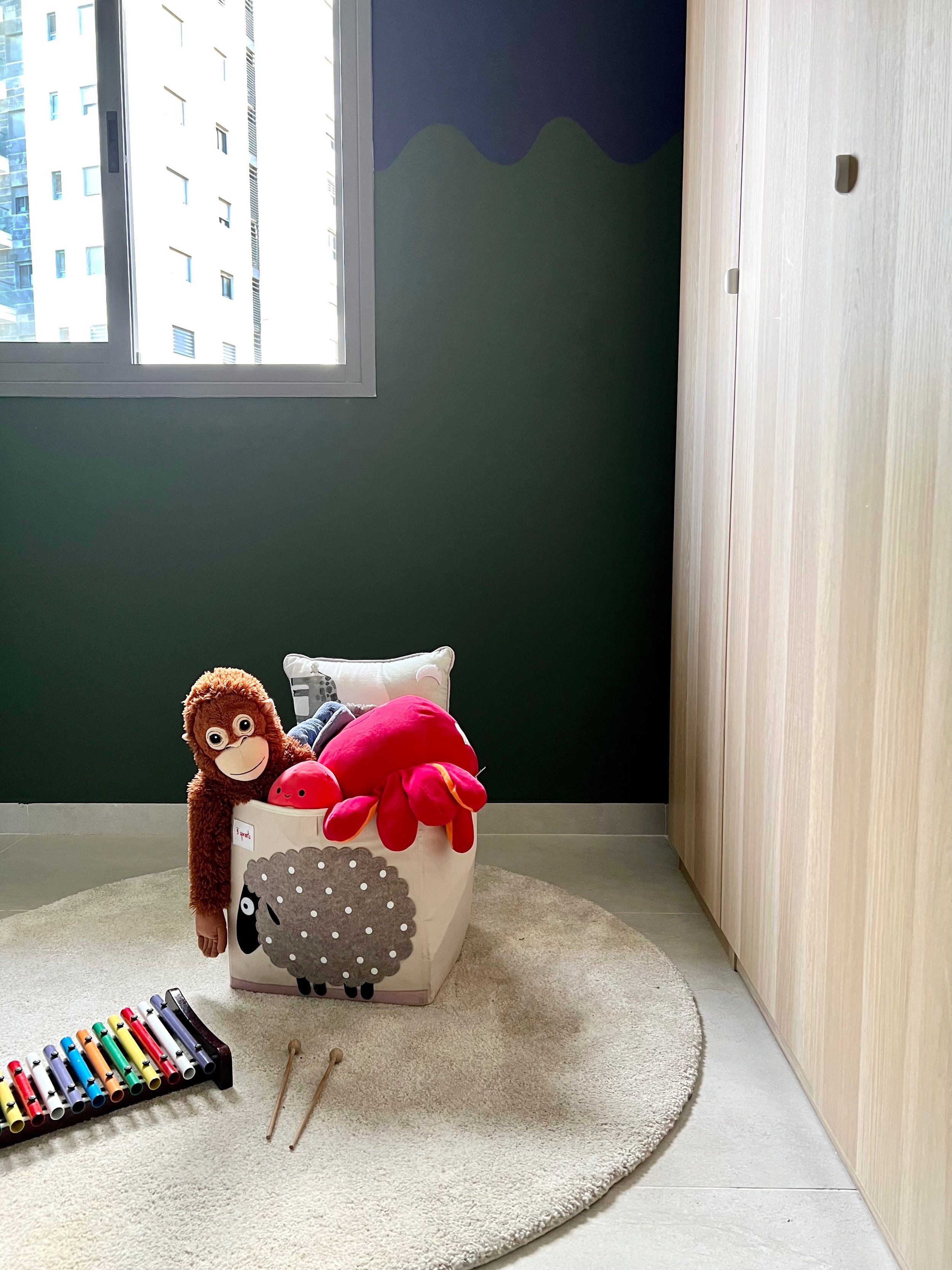
I set up our apartment to accommodate the mayhem of two toddlers at play who sometimes need a change of scene. Toys and activities are spread throughout the home, from living room to dining room to hallway to kids rooms. When movement is part of the design, everything feels a little less crazy.

Photo: Peled Studios \ יואב פלד צילום אדריכלות
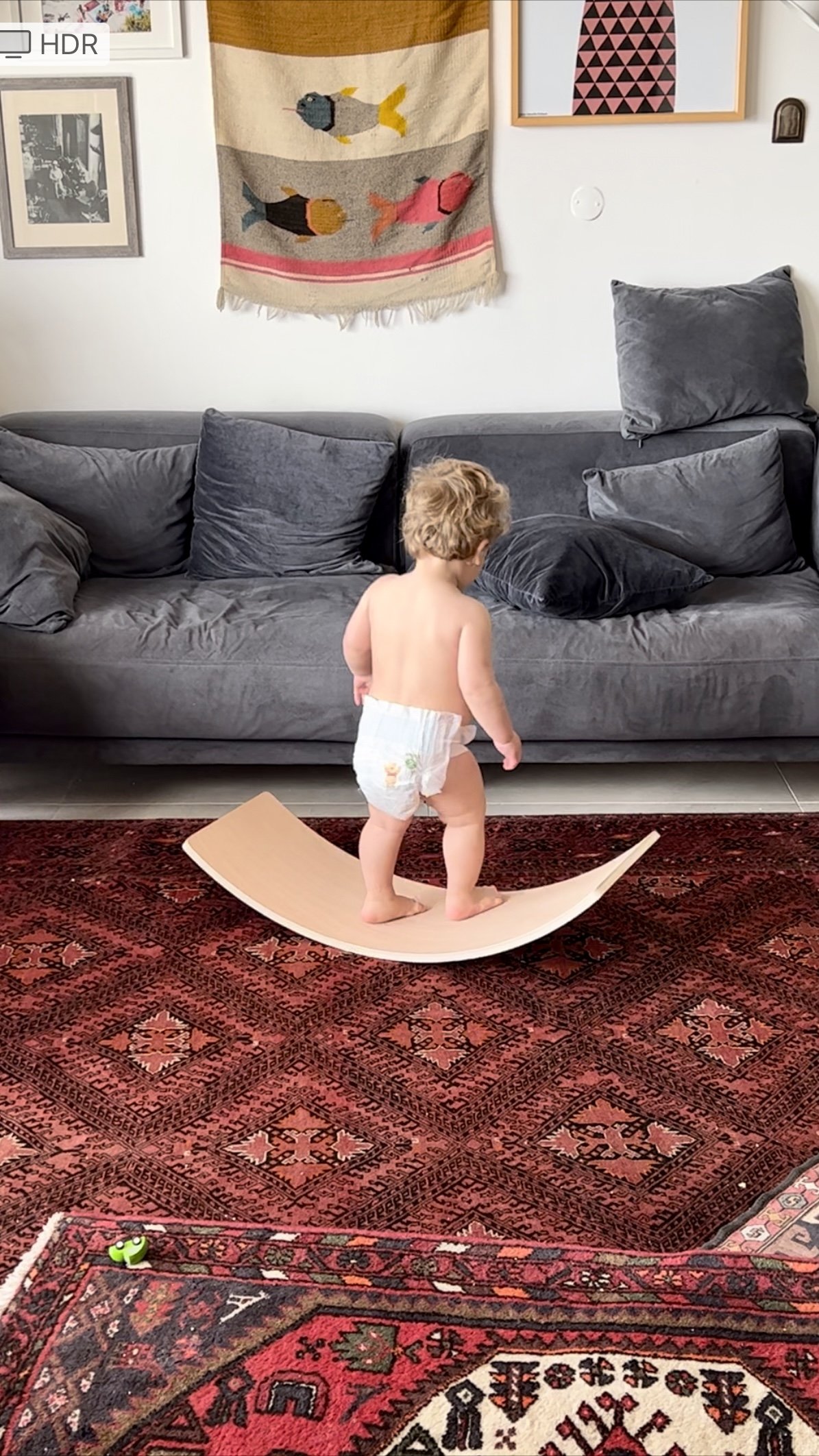
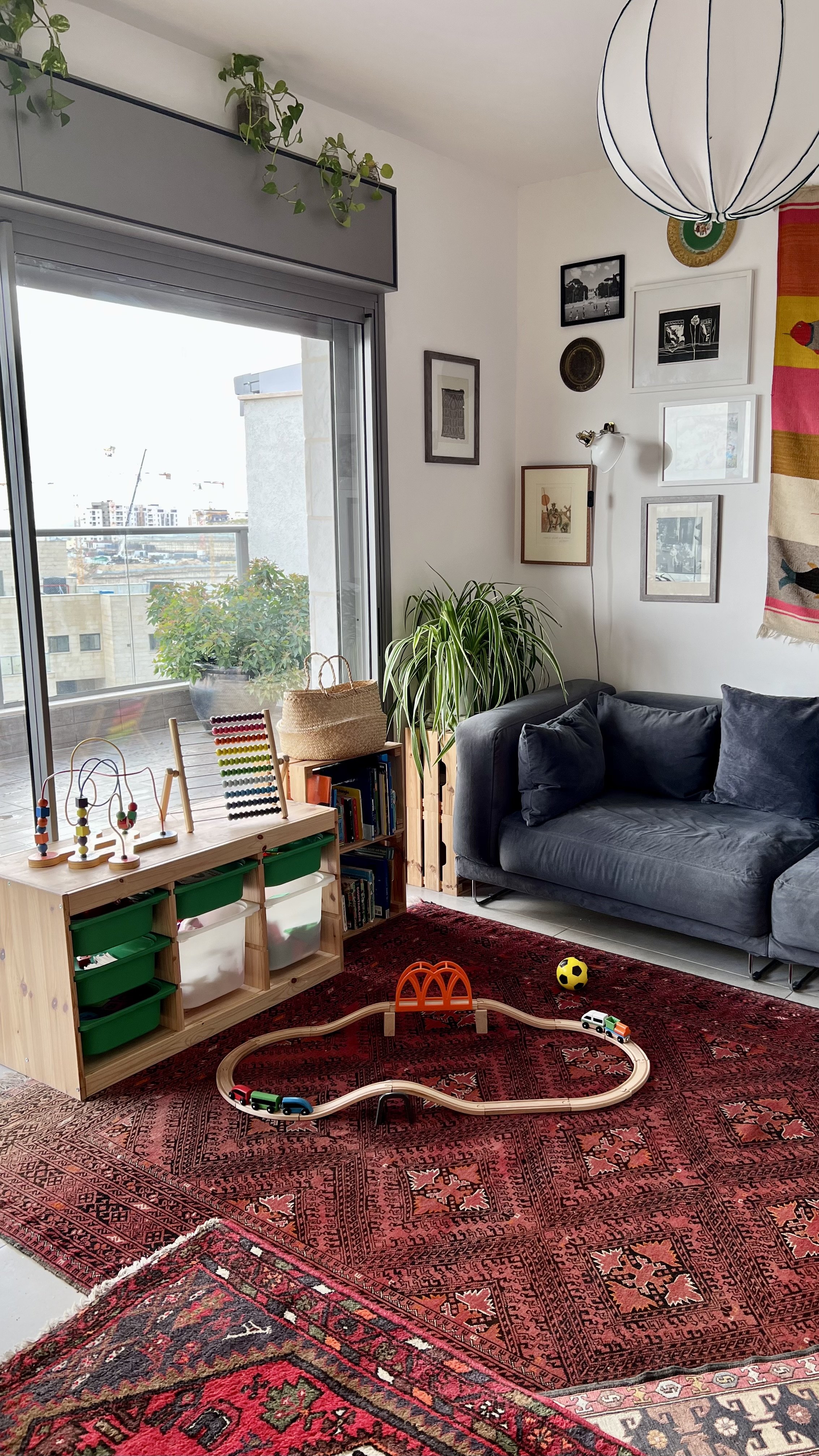
We have an IKEA Trofast storage unit in the living room as well as by the dining table leading to the hallway. It’s easy for kids to pull out toys and for us to switch out bins with different toys from time to time to keep things fresh. I have found that removing a few bins at the top (unlike in these photos) makes for easier cleanup because you don’t need to pull out every bin to dump toys back in. Generally, having fewer toys available helps kids focus.

Photo: Peled Studios \ יואב פלד צילום אדריכלות

Photo: Peled Studios \ יואב פלד צילום אדריכלות
The kids can hop seamlessly from the living room floor to the dining room table to the play corner. Defining areas by type of activity (e.g., building, arts and crafts, make believe, reading) helps create sanity.



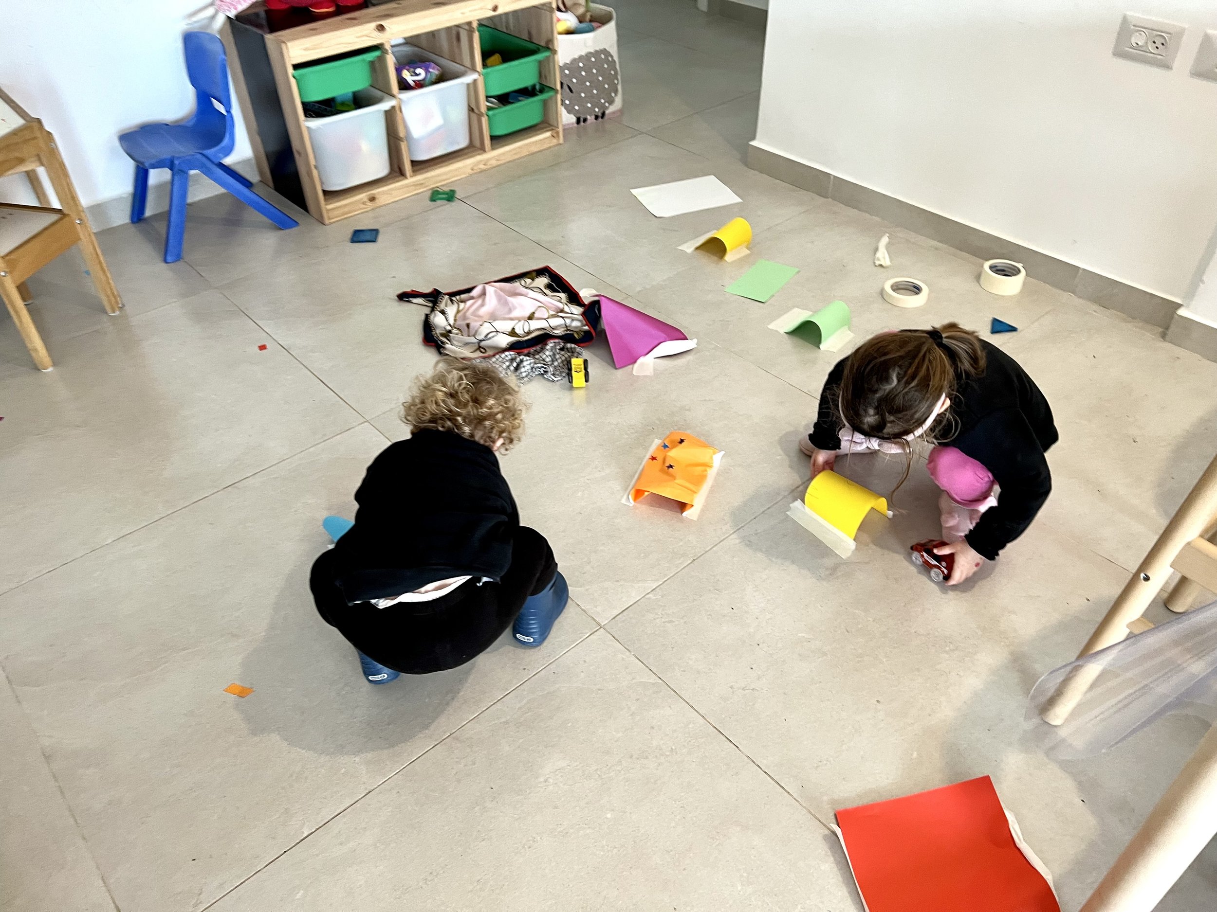

Photo: Peled Studios \ יואב פלד צילום אדריכלות
Immediately after putting the round rug down in Sol’s room, the kids started running around it in circles and laying dolls and stuffed animals around its periphery. It’s great to have for any activity where you want to gather around (pass the balloon, story time, etc.).
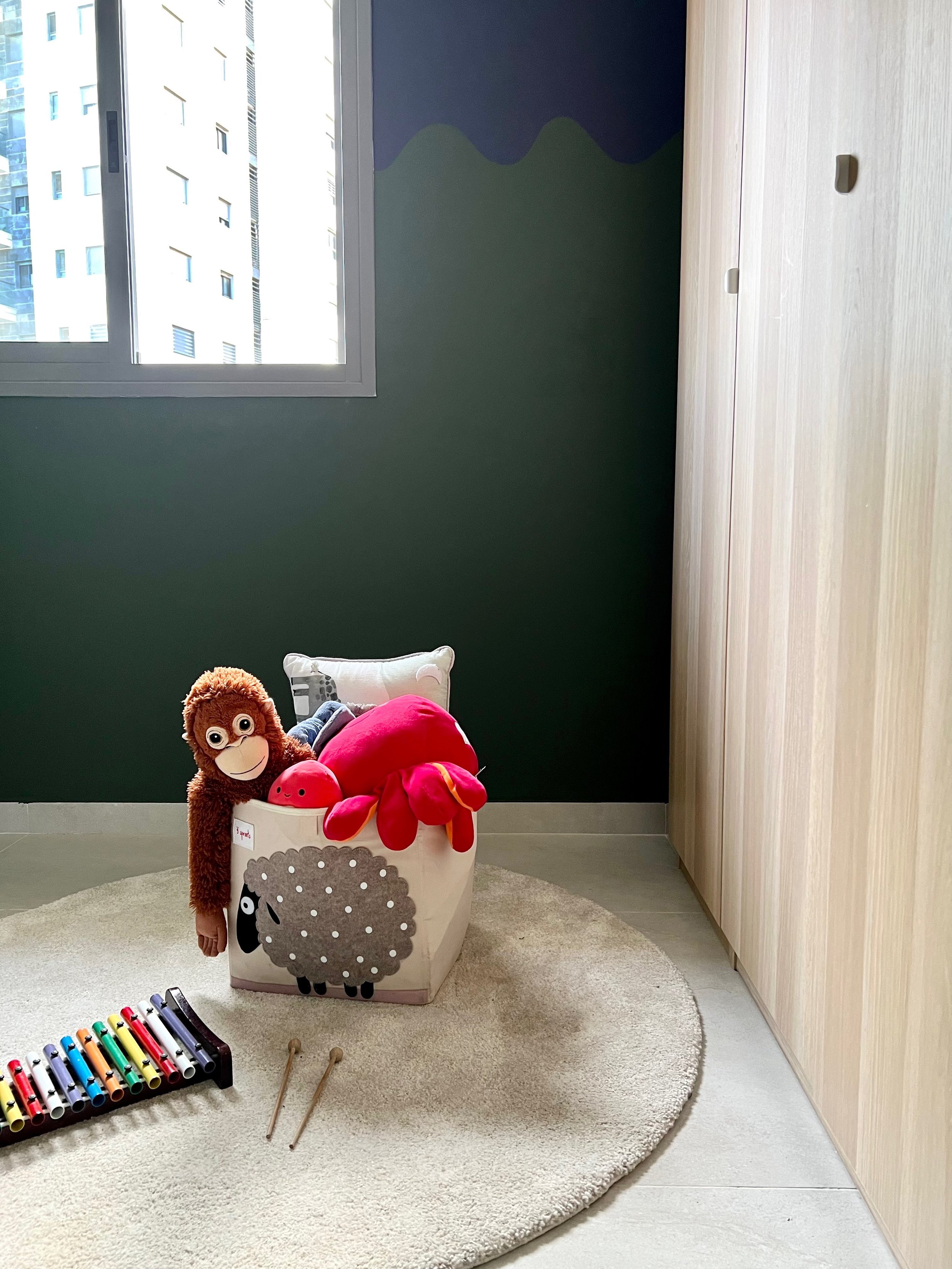


Photo: Peled Studios \ יואב פלד צילום אדריכלות

Photo: Peled Studios \ יואב פלד צילום אדריכלות
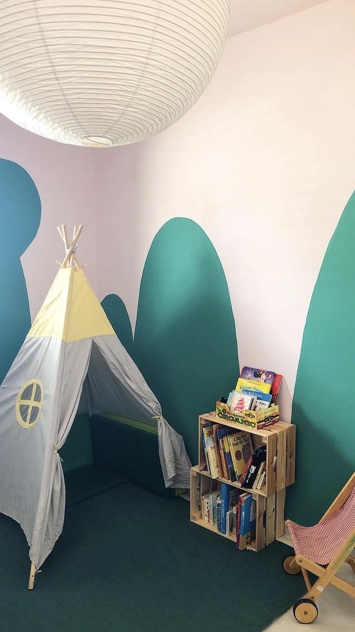
In Talia’s room, the teepee and book corner work just as well for intimate reading time as they do for going nuts with the floor mats.

Choosing My Kitchen Backsplash (a Fairy Tale)

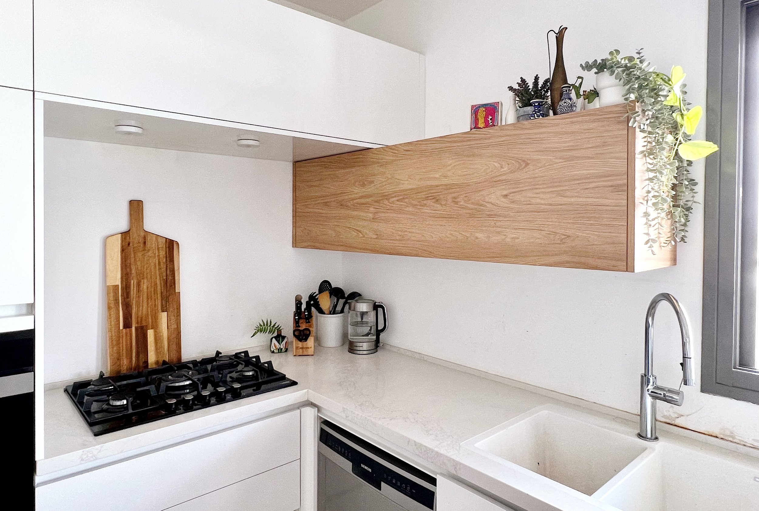
When we made Aliyah in 2021, we moved into a newly built apartment in Modiin fresh from the kablan (contractor). Because we’d been Airbnb’ing for 6 weeks already and I was 9 months pregnant, we were eager to get the keys, so the owner rushed the final to-dos and left the kitchen without a backsplash. As you can see below, this isn’t great for the wall behind the sink or the stove.
The owner is now selling the apartment and we’ll likely get the boot within a year, but I’m taking a trip down fairy tale lane to consider how I’d tile the backsplash. If we zoom out for a second you’ll see there’s already a lot going on in the living room and the surrounding areas:


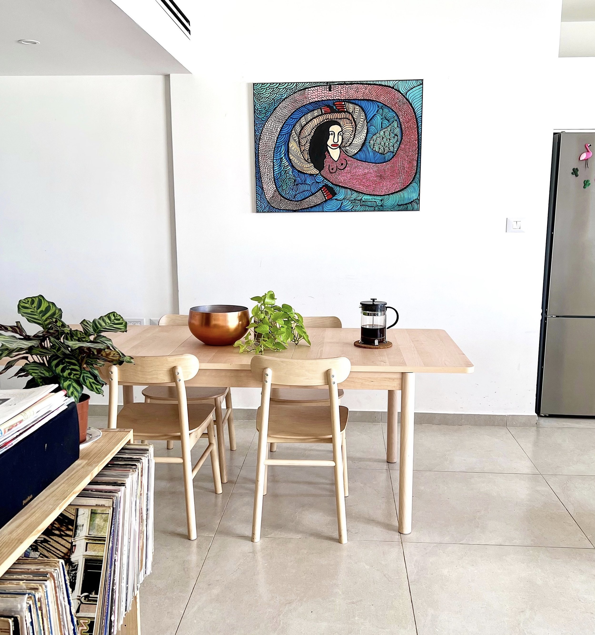

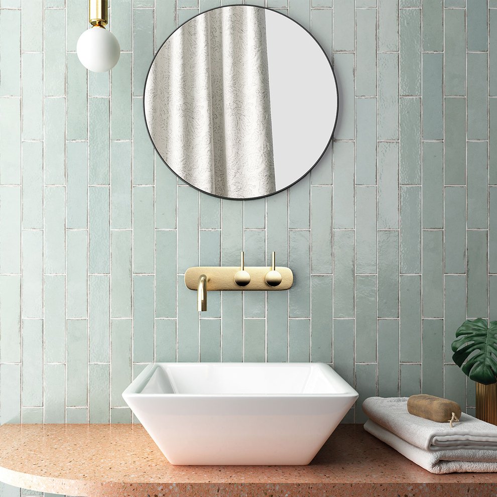
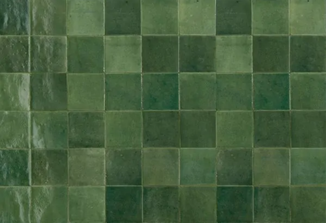
If I was to do a color, a green tone could be nice, to complement the plants and contrast the red and pink hues of the living room. I’d do a vertical or square pattern to balance the horizontal cabinetry. These mint tiles from Tile Israel could work, but I’d place them side by side rather than staggered for a more streamlined modern look. I really love these colorful green and white tiles from Balatot, but they’re too busy as pictured. Choosing just one or two of the tones could be fun. And I like these deep green squares from Milstone, but they feel too dark for this kitchen.
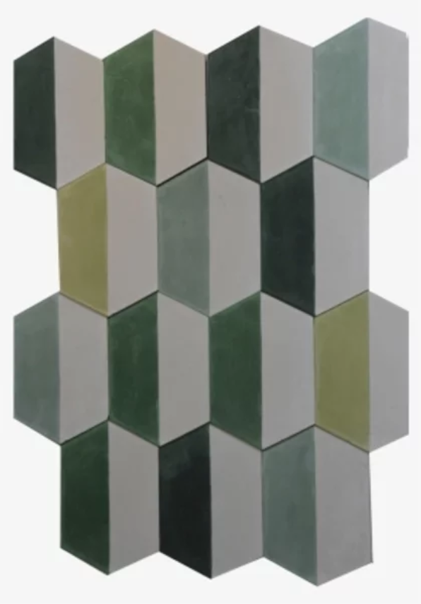
Here’s a test using just one of the green shades from the Balatot tile set:

If the white half of the tile is actually white and not grayish like this photo from online suggests, then I like it. This one requires some in person research, so let’s move on for now.

If I was to lay off the color and get white tiles, they should be matte, because the cabinets are already glossy, and white gloss on white gloss is overkill in this context. A plain white tile could work, but something with texture would be more interesting. I found this textured white tile from Studio Ceramica that looks wonderful:
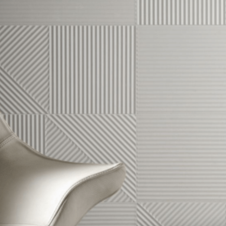
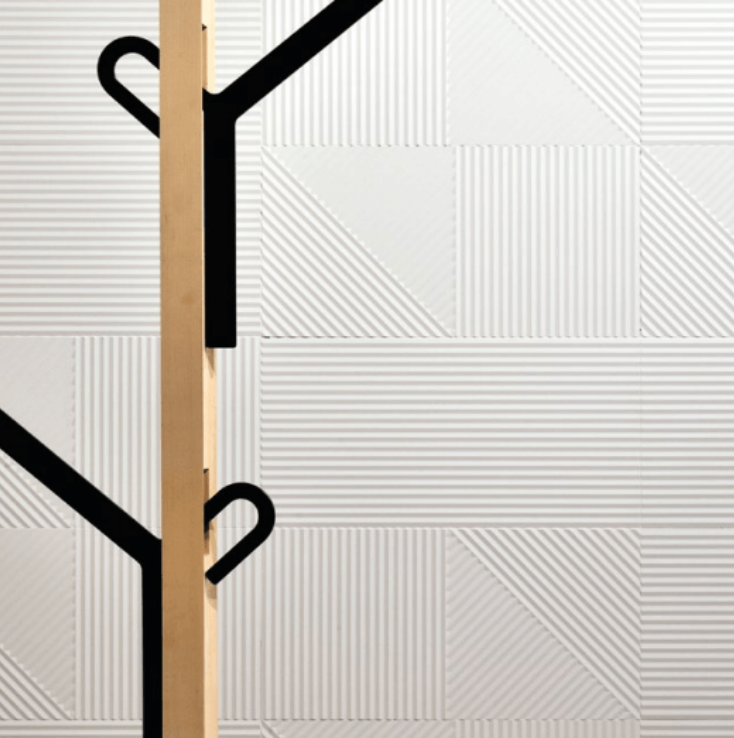
The downside is it’s probably terrible to clean and not ideal for a grease-catching kitchen backsplash. (I’d look into this further to be certain.) If we’re back to the drawing board with whites, these Milstone and Kal Vahomer rectangles are available in a matte finish and would be a simple elegant option, stacked cleanly like at left.
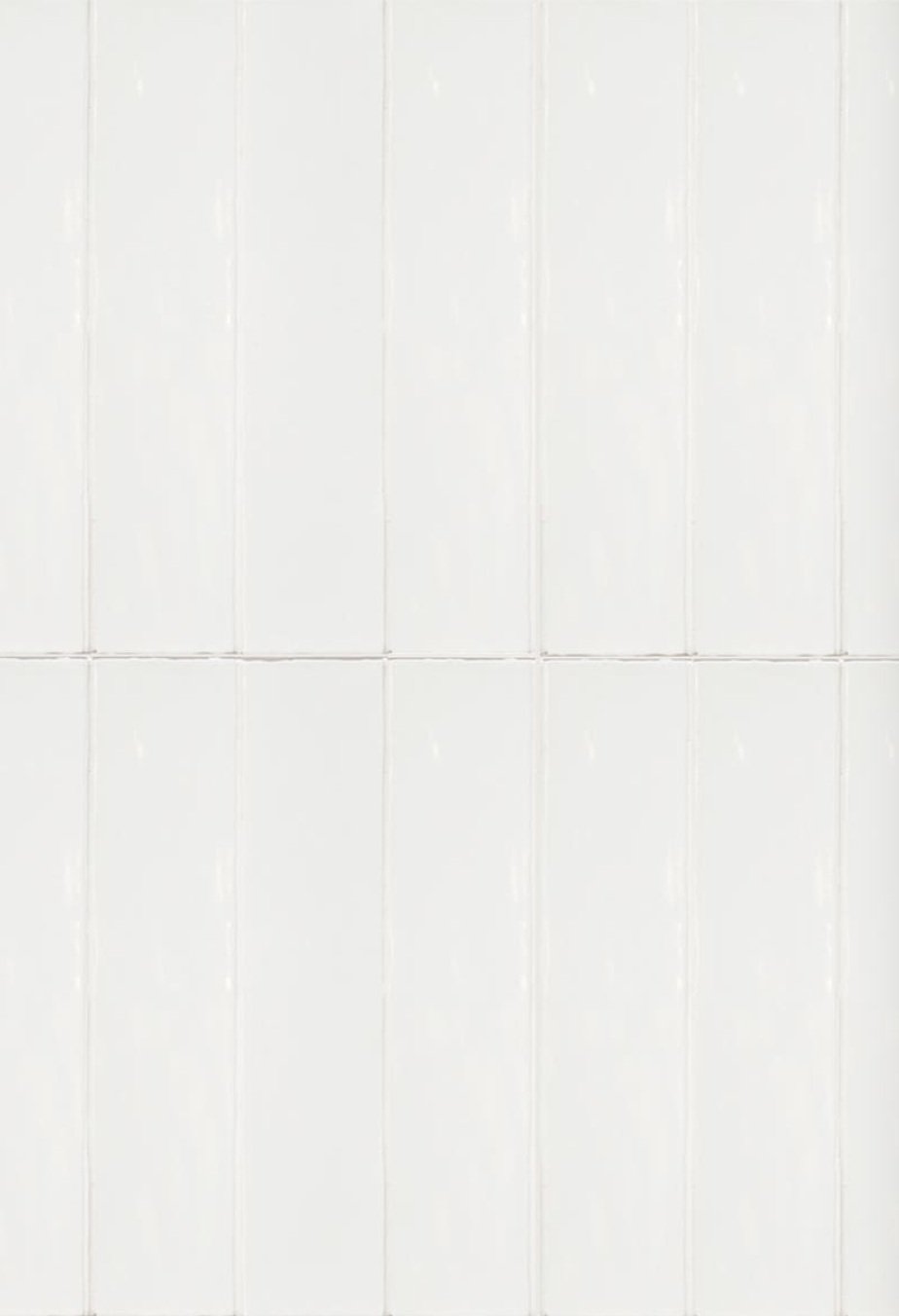
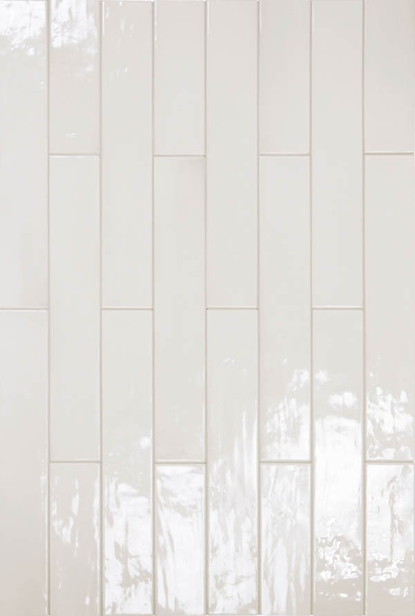

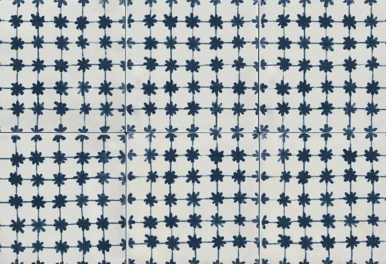
So that’s a workable white solution. But it’s a bit of a yawn. And while there’s nothing wrong with a good clean yawn in a good clean kitchen (I do love a white kitchen), I keep circling back to the tiles on speed, like this blue asterisk pattern from Milstone:
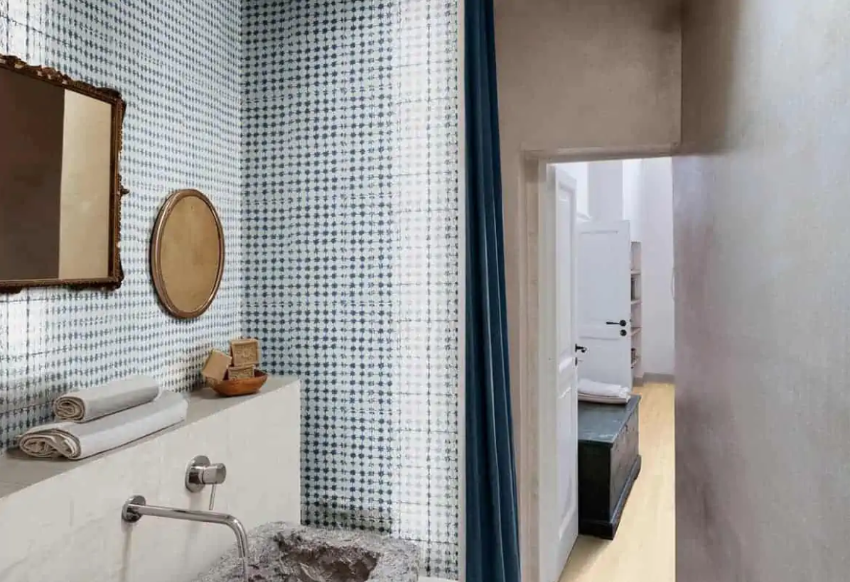
Testing it….

Kind of cute, no?
If I were really getting a backsplash right now, I’d visit tile showrooms in person.
Another option is to have the Caesarstone countertop continue up the wall, not have to choose a single tile, and live happily ever after.